Frequently Asked Questions
What shipping services do you offer?
We offer shipping via UPS. You can choose your shipping options during checkout.
What shipping services do you offer?
Due to the nature of this product and how each and every product is a custom printed product, we DO NOT offer returns. If something on your print doesn't look correct, we will work it out through email via info@titantransfersdtf.com. We will offer a re-print. If for any reason your product needs to be returned or you feel that a refund is due to you, you must return the product to us before a refund is issued.
What file formats do you accept?
We accept PNG files.
For the best print quality - the resolution should be 300DPI with a transparent background.
What are your heat press instructions?
- Place the design on the garment and make sure it's lined up the way you want it.
- Press for 280 - 325 degrees F for 10 - 15 seconds (Time and Temp depends on the type of garment)
- Our film is a cold peel or hot peel so either let it cool down and peel or wave your hand over the design a couple of times and peel hot.
- Peel film off.
- Recover with parchment paper or teflon sheets and press again at 325 for 10 - 15 seconds.
What time will my order be ready?
If you placed your order before 10AM - your order will be printed the same day unless something bad happens in our production process.
Once complete - you will receive an email or text message saying your order is ready for pickup / ready to ship!
Why does my image have white lines around it?
When you see white lines around your image - what you are seeing is called "Transparent Pixels".
Majority of the files you find online will have some sort of transparent pixels involved.
ALWAYS check your DPI of your image! If it doesn't say 300 DPI, your image is considered low quality and won't print the best it can.
There's a free website available to help edit your image called www.photopea.com - It's very similar to Photoshop.
What size do I need to make my DTF transfers?
We get asked this question every single day! Scroll down to see what the standard sizes are for each section of a t-shirt!
**Cell Phone Users - Turn your phone horizontal to see t-shirt images better.**
What size do I choose?
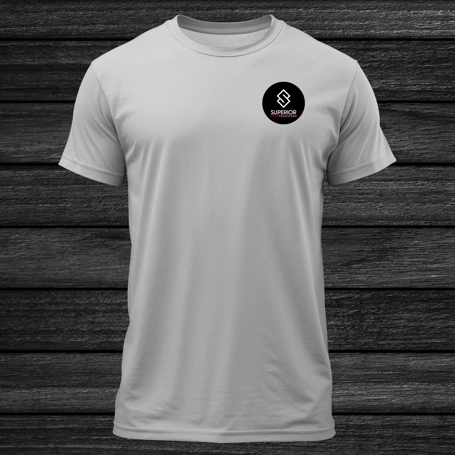
Left Chest
Standard Size: 2.5" - 5" Width / 2.5" - 5" Height
Average Youth Size: 3" Width / 3" Height
Average Adult Size: 3.5" - 4" Width / 3.5" - 4" Height
Oversized Left Chest: 5" Width / 5" Height
Placement: 3" - 4" From Collar / Centered over far edge of collar
what size do i choose?
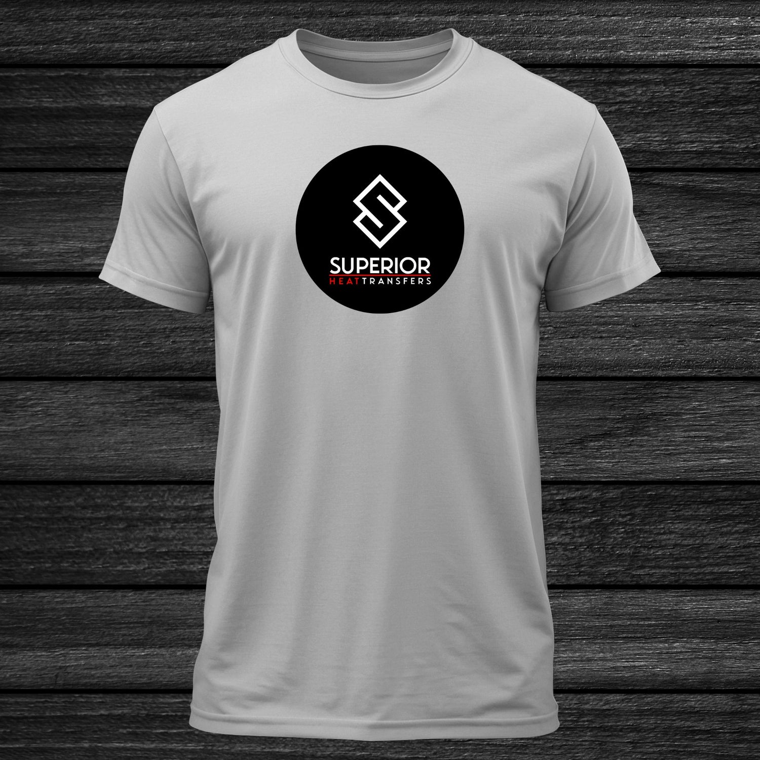
Full Front
Standard Size: 10" - 11" Width / 10" - 11" Height
Onesie / Infant: 6" Width
Toddler: 7" - 9" Width
Average Youth Size: 9" - 10" Width / 9" - 10" Height
Average Adult Size: 11" Width / 11" Height
Larger Full Front: 11" Width / 13" - 17" Height
Placement: 3" from collar, centered - designs that are
6" or shorter can go 4" down from collar
What size do i choose?
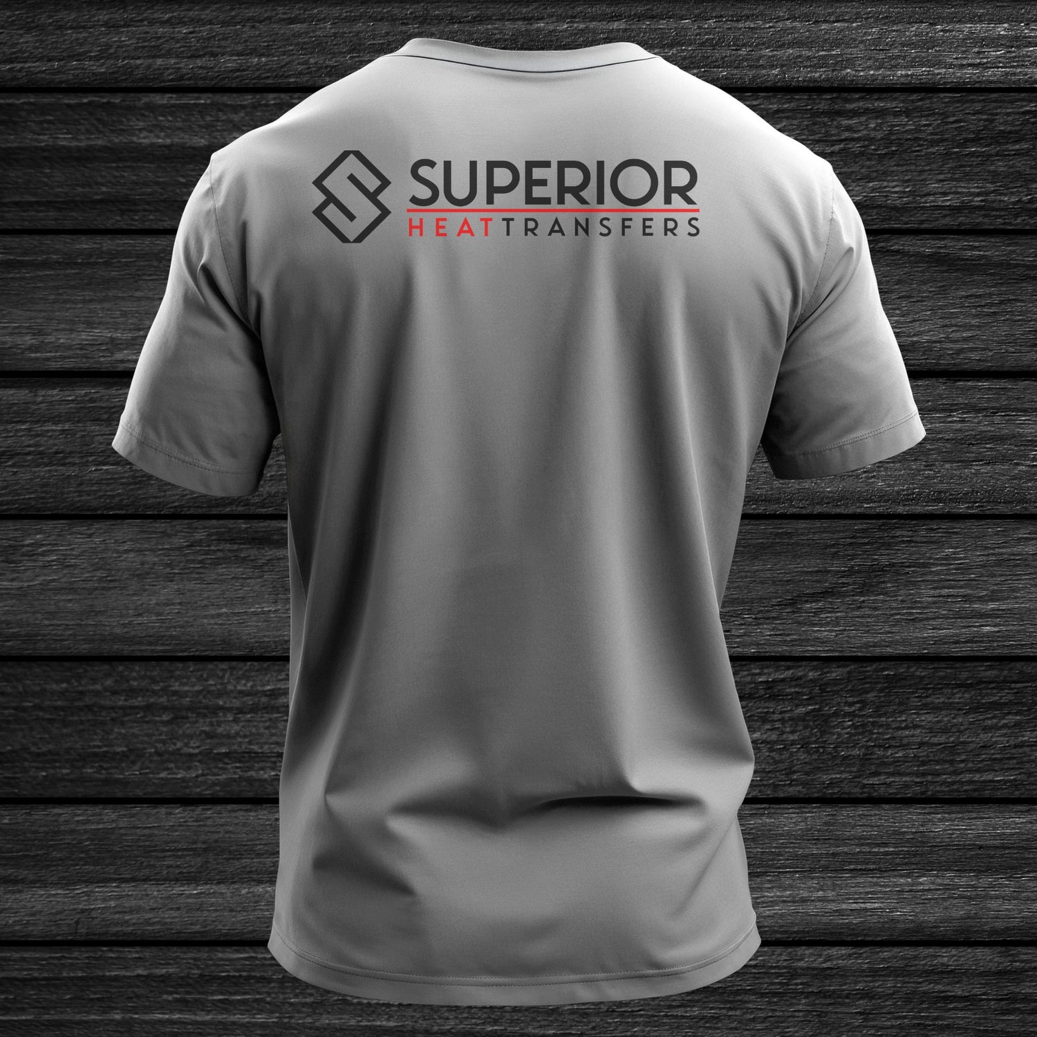
Upper Back
Standard Size: 10" - 11" Width / 1" - 6" Height
Onesie / Infant: 6" Width
Toddler: 7" - 9" Width
Average Youth Size: 10" Width / 1" - 6" Height
Average Adult Size: 11" Width / 4" Height
Sports Names / Staff: 10" - 11" Width / 3" Hight
Placement: 3" - 4" down from collar, centered
Designs less than 2" tall can go 5" down
What size do I choose?
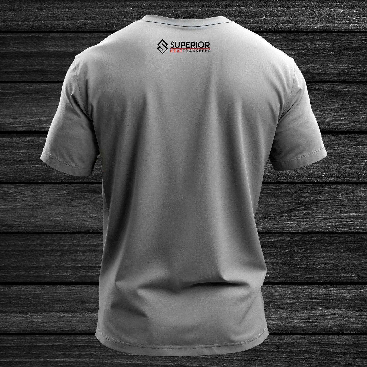
Back Collar / Neck Print
Standard Size: 1" - 3" Width / 1" - 3" Height
Average Youth Size: 1.5" Width / 2" Height
Average Adult Size: 2.5" - 3" Width / 2.5" - 3" Height
Placement: 2" down from collar, centered for larger designs
For smaller designs - 1" down
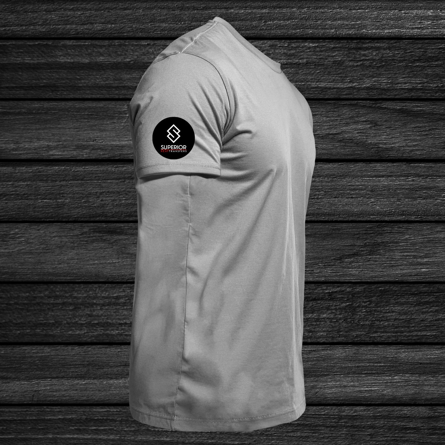
what size do i choose?
Sleeve
Standard Size: 1" - 4" Width / 1" - 4" Height
Average Youth Size: 2" Width
Average Adult Size: 3" - 4" Width / 3" - 4" Height
**For American Flag Prints - Make sure the stars are facing the front of the shirt**
Placement: 1" - 4" from hem, centered on shoulder seam
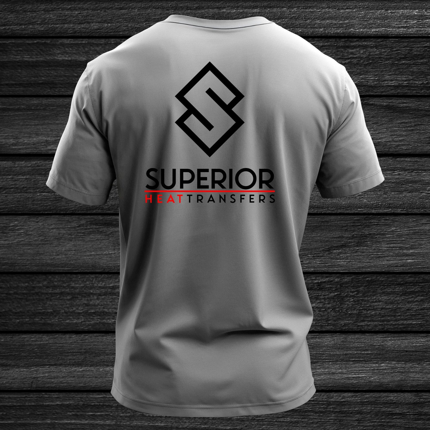
what size do i choose?
Full Back
Standard Size: 10" - 11" Width / 6" - 17" Height
Onesie / Infant: 6" Width
Toddler: 7" - 9" Width
Average Youth Size: 10" Width / 12" Height
Average Adult Size: 11" Width / 11" - 17" Height
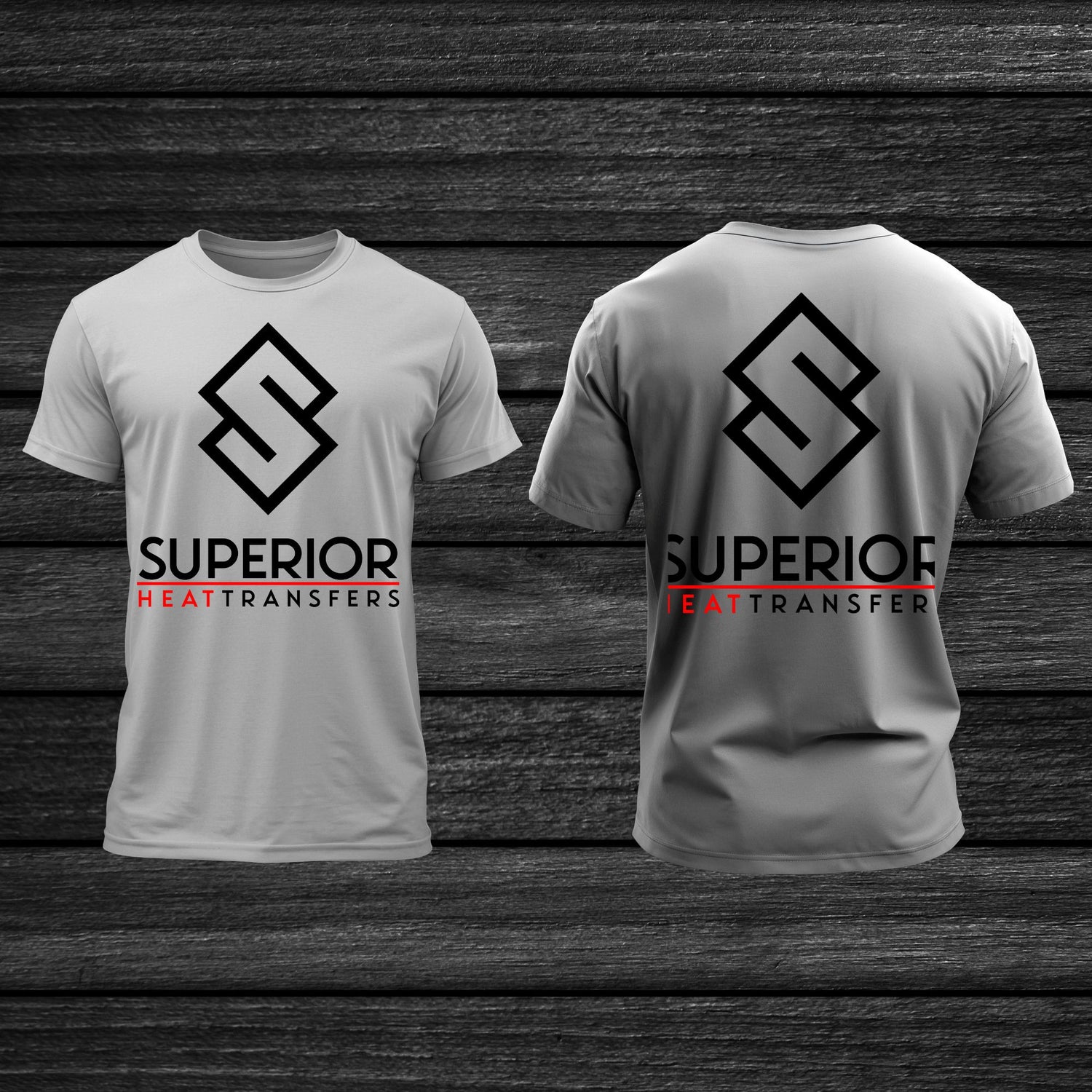
what size do i choose?
Oversize Front & Back
Standard Size: 12" - 15" Width / 12" - 17" Height
Average Youth Size: 10" - 11" Width / 11" - 12" Height
Average Adult Size: 12" Width / 15" Hight
Placement: 2" - 3" down from collar, centered
Oversize Back Placement: 3.5" down from collar
